Desktop + mobile
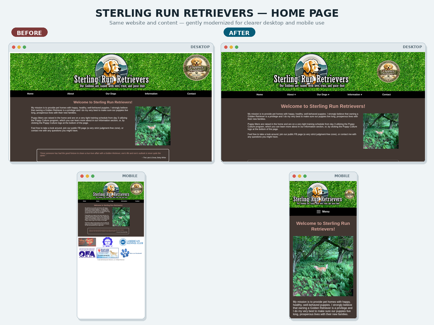
Home Page
Before-and-after comparison using the same page content and imagery.
Real project case study
A gentle modernization that kept the site recognizable while making it easier to use on desktop and mobile.
The approach
The original site had a strong identity and a workflow its owner understood. Instead of replacing it, the project preserved its grass header, logo, colors, page names, content, photos, URLs, and SSI-managed header and footer.
Improvements focused on mobile navigation, responsive images and tables, readable spacing, touch targets, and more consistent behavior across screen sizes.
Desktop + mobile
Before-and-after comparison using the same page content and imagery.
Desktop + mobile
Before-and-after comparison using the same page content and imagery.
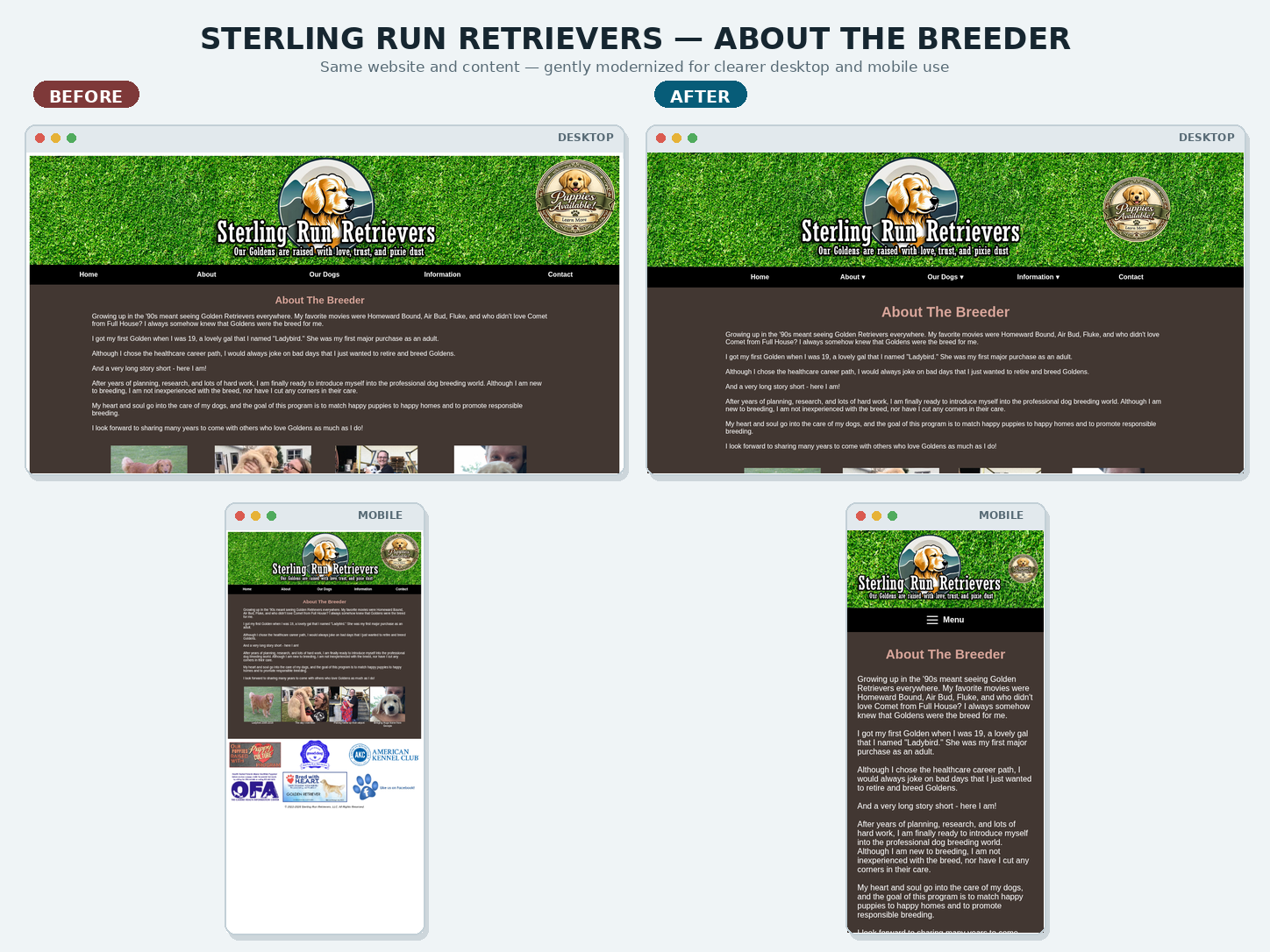
Desktop + mobile
Before-and-after comparison using the same page content and imagery.
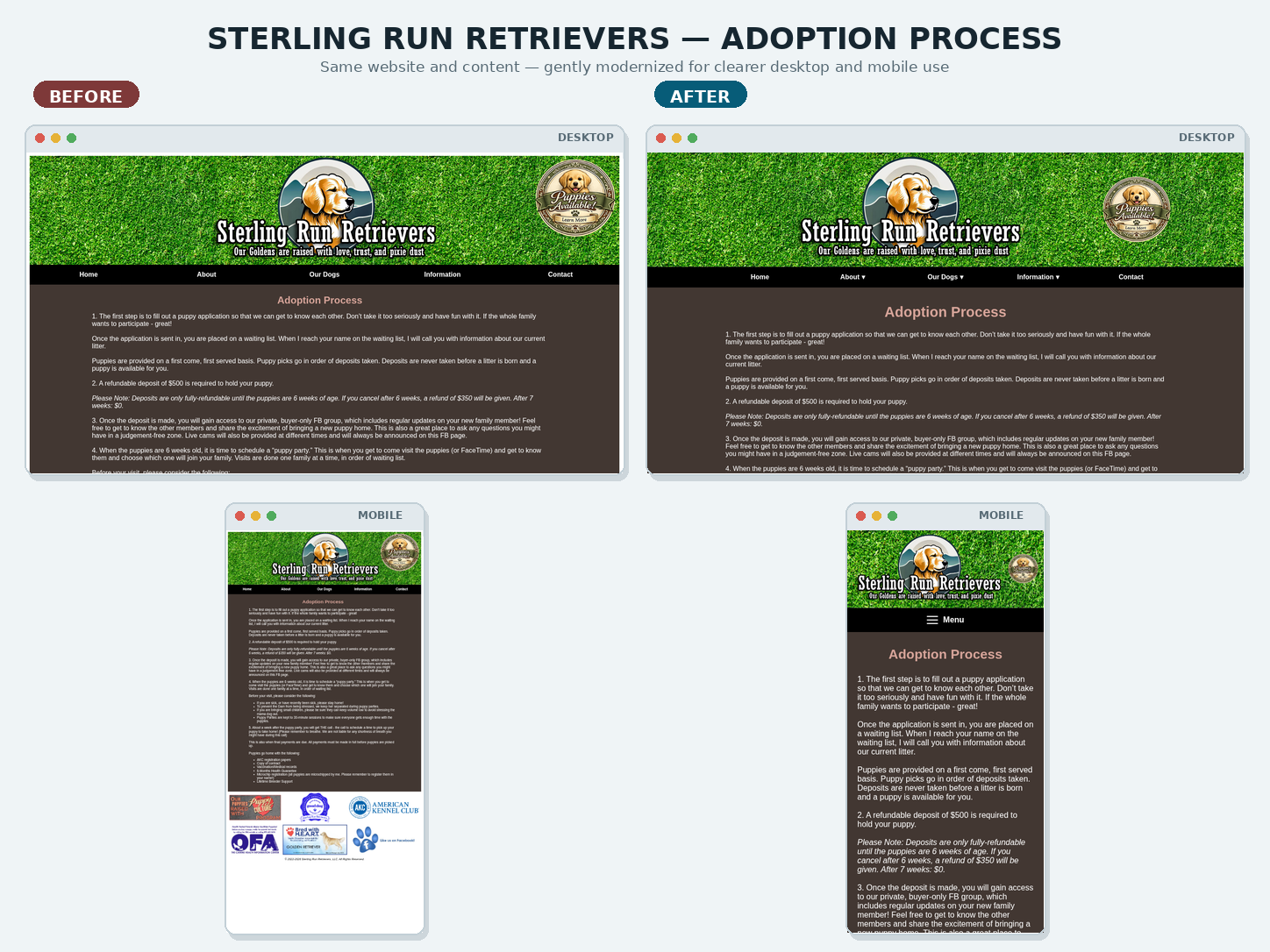
Desktop + mobile
Before-and-after comparison using the same page content and imagery.
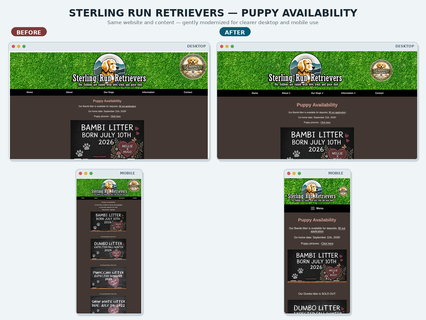
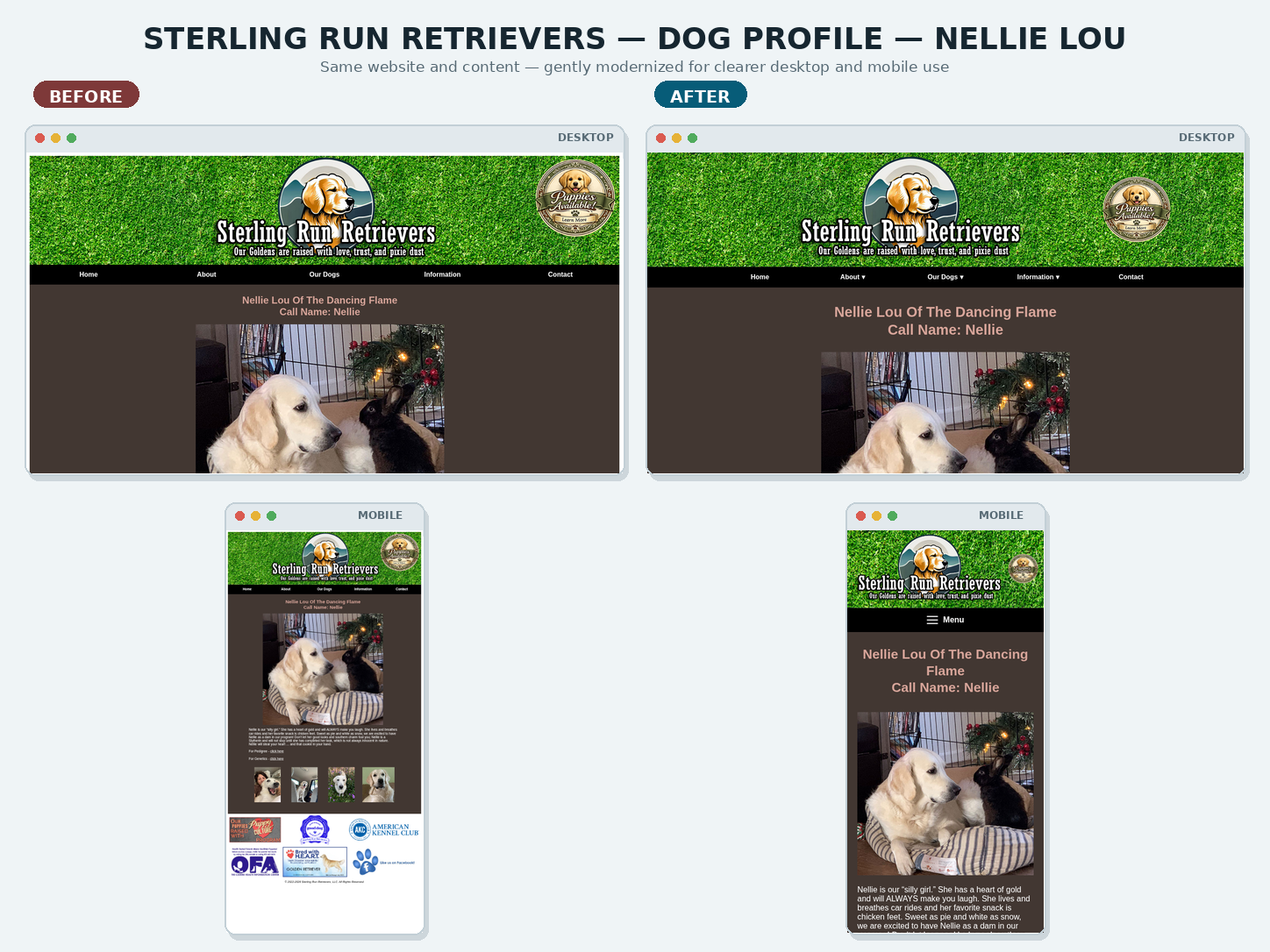
Desktop + mobile
Before-and-after comparison using the same page content and imagery.
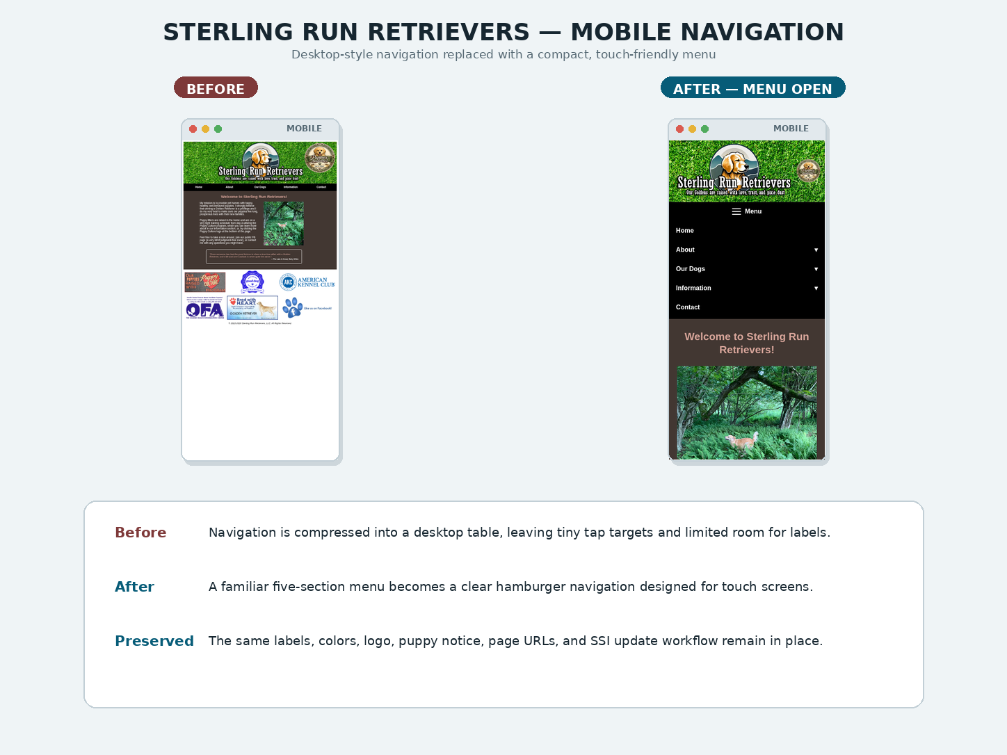
Mobile usability
The original desktop navigation was replaced on small screens with a touch-friendly menu while retaining familiar labels.
See it in use
The live site remains familiar to its owner while working more cleanly across modern phones, tablets, and desktop screens.